This page and the entire website are the result of a "code-first" philosophy. Eschewing heavy templates and
bloated builders, every line was hand-typed and implemented by me. This approach ensures a lightweight,
high-performance footprint that prioritizes speed, security, and a refined user experience.
Utilizing modern responsive design principles, each page is engineered with fluid grids and
flexible media. The layout dynamically adapts to any screen resolution, providing a consistent, professional
viewing experience across desktops, tablets, and mobile devices.
Validated Excellence and Web Vitals
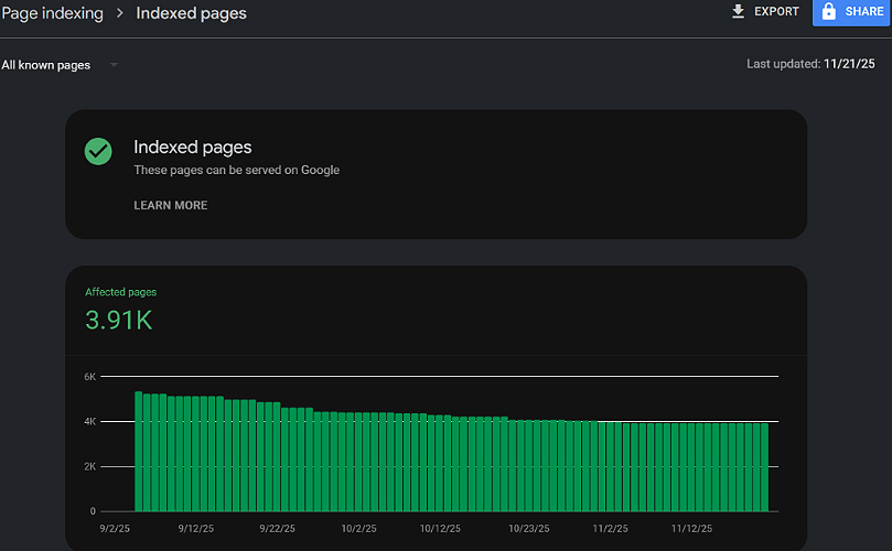
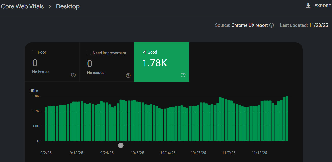
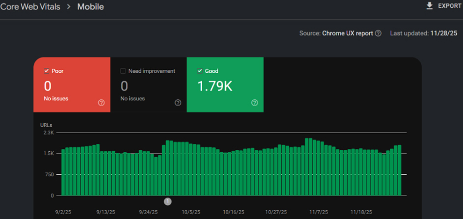
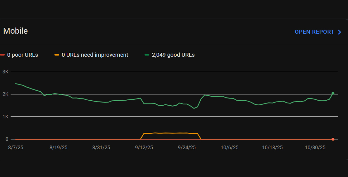
Below, I have outlined key metrics for the platforms I have developed, including Core Web
Vitals, store quality scores, and indexed page health. These data points serve as empirical
evidence of my ability to build websites that are not only aesthetically striking but are also technically
superior:
- Optimized Performance: Lightning-fast load times and efficient asset delivery.
- SEO-Ready Architecture: Clean, semantic HTML that search engines can easily crawl and
index.
- Google-Validated Quality: Consistently achieving "Exceptional" status across
performance
and accessibility audits.
To see the visual output of these development practices, please visit the Web Development
Assets page. For a deep dive into how these technical foundations translate into business
growth, including revenue tracking, customer acquisition, and page view growth, visit my Marketing Metrics page.
Desktop Core Web Vital Score
Mobile Core Web Vital Score
Graph of "Good" URLs
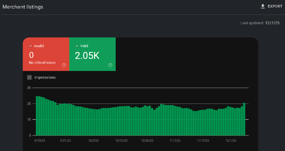
Over 2,000 Merchant Listings
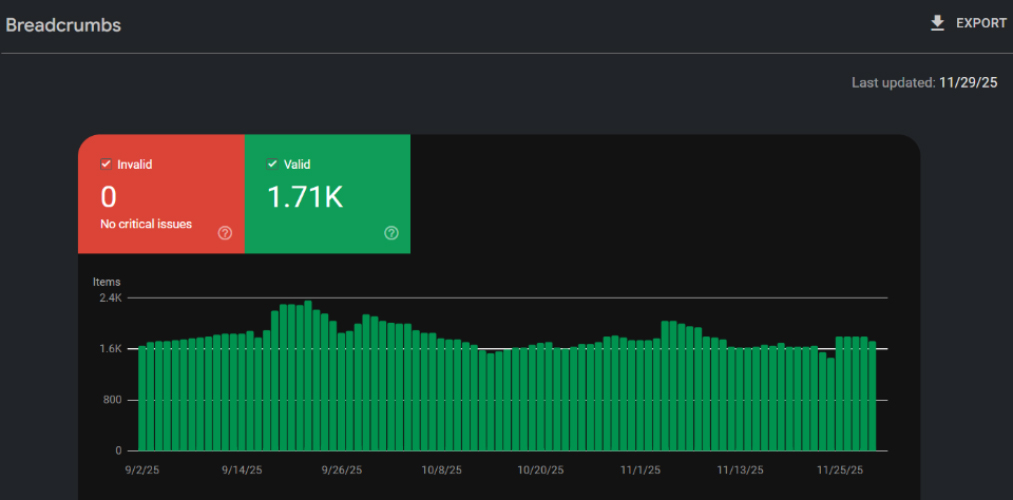
Nearly 2,000 Breadcrumbs Correctly Coded
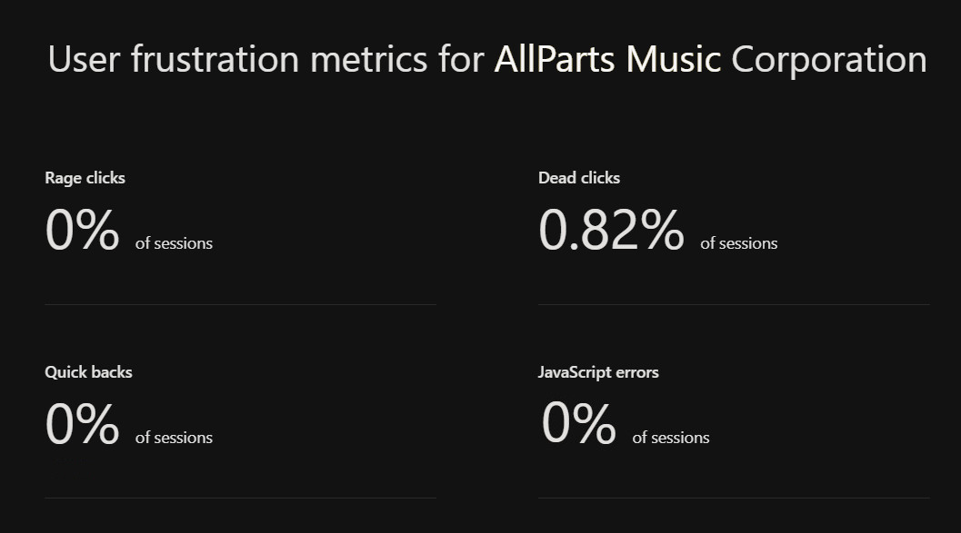
Perfect Score for Frustration Metrics
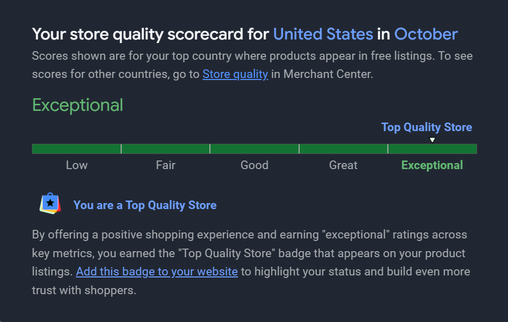
Ecommerce Site Labeled "Exceptional" by Google
Nearly 4,000 Indexed Pages